Monday, December 15, 2008

Claustrophobia


Diary Entry

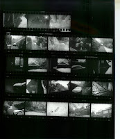
This project went pretty well for me in the darkroom. The times I had to expose the prints were manageable, and I only had one print that was hard to get right immediately. This was the print with my school books. Once I added a high enough filter (5), even that one didn't take me long to finish. I actually had to add a filter to 3 of the 4 claustrophobia prints, and I have become very fond of the filters because of the enormous improvement it made to my photographs.

Theory Notes

I found this project very hard in terms of composing prints that evoked feelings of "claustrophobia". I ended up looking back at old contact sheets to see if I had anything I could use in there. Two of my prints came from the first lighting project, taken in a forest. I used these because I thought the shadows in the forest could make a person claustrophobic. A shadow moves. Was it the wind, or something else? Alone in the woods, someone can start to feel very claustrophobic and panicked.

The other two I took specifically for the profect. For the print with the schoolbooks, I cleared my floor. My floor was very messy (as usual), but I didn't think it would be a good composition for this profect, because usually I feel comfortable in a messy room. After I cleared my floor, I just scattered around schoolwork (which always makes me feel claustrophobic)I think it worked well. Claustrophobia probably isn't the first thing a person would think of when they see the print, but when they know that is the theme, I think it makes sense.

My favorite print of the project, though, is the fence. This one I was careful and deliberate about. I shot on a gray day, to give it a gloomy mood. When I took the picture, I shot at an agle, to make the fence appear to go on and on and on. I also shot down the middle, where the woodenfence meets the chained one. I liked this because it supports the idea that no matter what kind of a cage you are in, it's still a cage that you cannot escape. If that's not claustrophobia, I don't know what is!


Printing Compositions

First Print: Trees and Road


T 12-18 sec. F 5 A 5.6

Final Print: A 5.6 F 5 T 15 sec.


Second Print: Schoolbooks

A 2.8 F 5 T 100-160 sec.


Final Print: A 2.8 F 5 T 140 sec.


Third Print: Fence Line

A 4 T 200-260

Final Print: A 4 F 3 T 350


Fourth Print: Tall Trees

A 5.6 T 20-80


Final Print: A 5.6 T 65


Image Bank

Teresa Zafon taught herself photography, although she has taken some lessons in the past few years. This print was titled "Nightmare", and just looking at it gives me that unpleasant gut feeling in the pit of my stomach that I get when I know I'm trapped. Creepy, huh?
http://www.teresazafon.com/index.html

James Nachtwey also taught himself photography. He studied film and political science in university. He was inspired by photographs of the American Civil Rights movement and the Vietnam War. Now, he documents atrocities around the world, especially war. This is a photo of 9/11. I chose this one, even though I like some of the others better, because I remember that day, and how afraid I was. The feeling I remember makes this image the most claustrophobic for me. http://www.jamesnachtwey.com/


Amanda Norman gets her obsession with vampires and graveyards from the horror movies she watched growing up. Some of her images are rather disturbing, but most of them capture the creepy atmosphere of a graveyard. I chose this image because it makes me feel claustrophobic (and very mortal) to think that my name could be on that gravestone. It sort of freaks me out.
http://www.amandanorman.com/

P. S. Maybe our next project can be something a little less creepy...

Thursday, November 20, 2008

Hair


Diary Entry
This project was uber-frustrating. My contact sheets came out alright, but all of my final prints ended up gray. The print of Renee was the most difficult print I have ever had to produce. I had to keep changin all of the settings- the filter, the aperature, the time of exposure. I tried so many different combinations trying to get the print to work. It wasn't working. At one point I was actually up to 1000 seconds of exposure! After developing that one, it was still very white. I finally switched enlargers to see if that would help. It did. Something was wrong with the enlarger I had been working on. Of course, after switching enlargers, I had to completely start over to find the right settings. It finally came out, but it doesn't have the contrast I would like it to. The same goes for my other two prints- I wish they had more contrast. This was defiantely not my best project.
Theory Notes
Flashes need to be used when there is not enough natural light to expose the negative. Usually, you should use flashes indoors. Flashes work best when they are not mounted on the camera and are placed at an angle in reference to the subject. If the flash is placed straight in front of the subject, an unnatural reflection of the flash is usually seen on the subject. A common example of this is the redeye effect. To prevent this, the flash only needs to be moved to another angle. Another good practice when using flash photography is to point the flash at a white surface so it will reflect off of the surface onto the subject. This means that the flash is not as powerful because less light is exposed to the subject, but it has a more natural look. If you choose to use the flash in this manner, you may need to make the flash stronger and point the flash at another wall.


Light meters are used to determine what aperature and shutter speed settings you need when you take a picture. It is especially important in the circumstances where there are different levels of light intensity. For example, you would want to use a light meter if you were taking a picture of a sunrise or sunset. The most important thing to remember when using a light meter is to point it at the area of an average light intensity. This will help you to avoid one part of the image being underexposed or overexposed.


Printing Compositions

Filter 3 Aperature 5.6 Time 100- way too light

Filter 3 Aperature 5.6 Time 200- needs more time

Renee Final Print: Filter 3 Aperature 5.6 Time 230 seconds


Aperature 5.6 Time 130- needs more time- black is not dark enough


Aperature 5.6 Time 150- needs more exposure
Ines Final Print: Aperature 5.6 Time 180 seconds


Filter 3.5 Aperature 5.6 Time 600-still too light

Filter 3.5 Aperature 5.6 Time 700-still needs more time


Faith and Renee Final Print: Filter 3.5 Aperature 5.6 Time 850 seconds


Image Bank
Andy Chipling:
Chipling has been doing proffessional photography since 1979. He works with clients very well to produce beautiful images in both traditional and modern styles. I chose this image because...well, it's just really interesting. I like the puffy hair above the forehead, the colors, and the strands along the neck. It is very unique.
http://www.hair-photography.com/

Jim Crone:
Crone lives in the UK where he specializes in hair/beauty photography. He is very experienced, with over twenty years of work behind him. I chose this image because I like the way the light is reflected on the hair, giving it a faint red glow. It is very glamorous, but not in a "me, me, me" kind of way.
http://www.jimcronephotography.com/

Rick Bedrosian:
Bedrosian has been taking pictures since he was a young boy. He got opportunities to travel when he became involved in the band Hair of the Dog. He also worked as a tour guide. I chose this picture in particular because I like how depth is shown in the hair.
http://www.hair-of-the-dog.com/bio_rick/photography.htm


Wednesday, October 8, 2008

Fashion Photography (lighting II)


Diary
I had trouble with two things for this project. When I shot for accessories, the film did not catch in my camera, and then I had no pictures. Note for next time: do not close the camera until you test that it’s working. The other thing was that I shot at night, with a big spotlight. I had to use the special paper to really bring out the black. It also made for a grainy texture. This is not necessarily a bad thing, but something to remember for the future. I also had some troubles on Blogger. There were two images that I could not upload. One was a contact sheet, and the other was my high heel final print. I will try to rescan them and see if that helps.

Printing Compositions
Shoes
This test strip was exposed at aperture 2.8 for 15 seconds. I really wanted to see the contrast better where the light is shining, so I increased the time.

This image was shot in bright sunlight coming through the doorway. I used my zoom lens to get up close so I could capture the hard light that shines through the clear material of the high heel. The final small print was exposed for 22 seconds, at aperture 2.8.
Clothing
This test strip was taken at aperture 2.8 with times 20, 25, 30, and 35. The blacks didn't come out, so I increased the time.
This was the picture I shot at night, using a spotlight. This was hard to manipulate because of the surrounding darkness and grainy texture, but when I switched to the other paper on the big final print, it went more smoothly. The small final print was exposed for 60 seconds at aperture 2.8.

Accessories
This test strip was exposed at 2.8 aperture with times 22, 24, 26, and 28. It is too light, so I added a lot more time.
I shot this during the day, at about 5:30 under a cloudy sky. I had little to no trouble in composing the print. This small final was exposed for 68 seconds at aperture 2.8.


Theory Notes
Low Light
Although low light pictures are harder to shoot, they are good because they produce a very soft and gentle effect. You would be shooting in low light during sunrise, sunset, or even at night. The best thing to do when shooting in low light is to use a tripod. Because the shutter speed has to be slow for the film to be properly exposed, a tripod is needed to prevent the camera from moving while the picture is being taken. It might also help to use a film setting (ISO or ASA) a bit faster than the actual film speed. The film speed itself should already be fairly fast for the film to be properly exposed at less time.
Sun Light
Images shot in sun light are easier than those in low light. You definitely have to be careful of lens flare, especially when shooting with the sun behind the subject. For the best effect, the sun should be to the side of the subject. Also, be aware of your aperture. The brighter the sun is, the more you want to close your aperture.

Image BankJason Christopher is a fashion photographer, born and raised in California. His images usually have sharp lighting, and the beauty is emphasized by sharp lighting. His motto is “Be prepared or prepare to fail.” I chose this image because I thought it was a good representation of his work, which can be viewed at the following link. http://www.jasonchristopher.com/bio
Stephan Eastwood was born in New York, and taught himself the art of photography. His main focus is beauty, and he even did some modeling when he was young. I chose this image because it depicts the beauty Eastwood strives for in a classy way. http://www.stepheneastwood.com/bio/index.htm

Trevor Brady is a photographer of fashion and advertising. I chose this image because I wanted to see how a photograph for advertising can be effective. I think the water droplets make the image more effective. http://www.trevorbrady.com/

Friday, September 12, 2008

Lighting Project 1

Contact Sheets


Hard Light Portrait


This test strip was produced with aperature 8 with 3.5 seconds. It is too light, so I increased the time.


My first and final full print was taken at the same aperature with 6 seconds of exposure. It expresses the use of hard light because of the shadows, especially on her face.
Soft Light Portrait


This test strip was taken at aperature 8 and expsed for 4, 5, and 6 seconds, respectively.


This full print was taken at aperature 8, exposed for 3 seconds. The wall is too bright, and Faith is a little light.


So, I tried burning. I exposed the whole print at 2.5 seconds, and then tried burning (which is very poorly done) at 4.5 seconds.


Since the burning did not work out for me, I ended up exposing the picture for 5.5 seconds at aperature 8, and left it in the developer for longer so the wall would get darker. This demonstrates soft light because of the gradual lightening and darkening of the skin (on the arm for example).

Hard Light Still Life


This test strip was taken with aperature 5.6 at times 4, 6, 8, and 10.


This full print was taken at aperature 5.6 and exposed for 7 seconds. It expresses hard light because the light is hitting the flower is such a way as to make it really stand out from the background.

Soft Light Still Life


This test strip was taken at aperature 5.6 and exposed for 7 seconds, and it looks pretty good!


Please ignore the rainbow (my scanner...). This full print was taken with the same settings as the test strip and came out fairly well. It demonstrates soft light because of the gentle shadows in the backgroung, as well as the ones showing the texture on the flower.

Hard Light Landscape


This was taken at aperature 8, exposed for 9 seconds. The contrast here is very good, and it demonstrates hard light in the drastic shadow changes on the pathway and in the trees where the sunlight falls.


I had a lot of trouble with this print. This is taken at aperature 2.8 and exposed for 15 seconds. It was supposed to demonstrate soft light in the landscape form, but no matter what I tried to do on the enlarger, I could not manipulate it enough to show that. In order for it to be soft light, the reeds in the background would have to be darker, and not hit directly by the sunlight. The same thing would have to happen with the algae (or whatever it is) growing on top of the water. Another problem is the trees in the background. The sunlight is hitting them directly on the top, but you can through to the inner branches, which are submerged in shadow. It was a little disappointing because I quite like the photograph itself, it just doesn't convey what I wanted it to.

Image Bank


This photograph was taken by Michele Clement, from the States. Clement won this year's first place Photographer of the Year award at the Annual Spider Awards Show. I chose this picture because it demonstrates soft light with the faint shadows. I also love the way Clement has captured a skewed moment; it's very creative.


This photograph was created by Cole Thompson. He decided to become a photographer at an early age, studying photography from both books and personal experiences. I liked this image in particular because of how creepy it is within the car, which is then contrasted by the bright sky seen through the winshiedl. It also demonstrates hard light, with the shadows and sharp contrast between black and white.


This photograph is from Steve Walton, a photographer from the UK. He has a passion for nature, where he gets his inspiration for photography. I chose this picture because of the natural elements of it. It is a beautiful landscape composition, and I love the way that Walton used the scant sunlight to his advantage, focusing on the rocks, which are not the center of the image.

Theory Notes

Hard Light


This demonstrates hard light because you can see the sharp shadow image of the finger on the hand. Hard light images, when outdoors, should be taken at a time when the sun is high and will give the best shadows and contrast. If you are using studio lighting, you should position the lights in such a way that will create shadows on the central object or person.

Soft Light


This demonstrates soft light. You can still see the shadow of the finger of the palm of the hand, but it is much softer. To achieve this with natural lighting, you would have to shoot at a time when the sun will not create as many shadows, and the contrast is more gentle than drastic. With studio lights, just position the lights so that it is spread evenly across the subject. You may also want to dim the lights.

Three Point Lighting


Three point lighting is fairly self explanatory. There are three lights, positioned in a semi circle around the subject. All three lights should be pointing at the subject, and coming from different directions.